Accessible Web pages are accessible by all persons, regardless of any disabilities.
CMS has been configured to make highly accessible Web pages, but it is still possible for you to create content that is very un-accessible in CMS if you do not create following the accessibility guidelines listed.
Please consider the following when creating Web content using CMS.
Why do our pages have to be accessible
By federal law, federal agencies and departments must provide accessible content--this includes Web sites.
Reference: Rehabilitation Act Amendments (Section 508) and Web-based Intranet and Internet Information and Applications
Note that it is not acceptable to have inaccessable internal Web sites even though no one in the organization currently suffers from disabilities that make the content difficult to use.
Use of headings
Take advantage of headings! Use them to create an outline of the page without skipping levels.
How to order headings correctly in CMS.
"The appropriate use of heading levels will improve the accessibility of your document.use. For example, use H2 to indicate a subsection of H1; do not use headers for font effects.You should nest the headings on a page in order
"Headings should be applied logically just as you would apply heading levels in an outline. Theoretically, if you extracted the headings from a web page that uses headings, you would have an outline of the page. You should nest the headings on a page in order. The heading structure may be used by some user agents to improve or add useful navigation features, or to abstract the document. The appropriate use of heading levels will improve the accessibility of your document.use. For example, use H2 to indicate a subsection of H1; do not use headers for font effects," [Use header elements to convey document structure, 3 Dec. 2008].
It is tempting to use a "higher level" of heading (or one that shows smaller text) in order to achieve a particular "look," but you should not use headings out of order!
Headings are just one tool used by some web technologies in order to make the page more accessible. They can be used to create an outline of the page, helping visitors gain an understanding of the page as a whole, and skipping heading levels results in a broken outline. Headings may also be used for navigational purposes.
So, keep in mind, no matter how much you want to skip from h3 to h5, just don't do it. In the NDSU template, you should always start with heading level 3, h3.
For the same reasons, you should NOT use headings to style text. Headings should be used like an outline for the page, NOT font effects.
Reference:
Use of images
A general guideline for using images on the web is as follows:
If a page is not usable without the image, it might not accessible.
What this means is that you have any information contained in the image, extra steps may be required. You need to add "alt" attribute text that describes the meaning/function of the image in detail OR the information conveyed in the image needs to be presented in text in another place on the page.
Learn how to add alt text in CMS.
Alt examples
Images to decorate, fill or space text
If the page would not lose any meaning if the images were missing, leave alt text blank or insert a space, such as alt=" ". Alt text will be read to visitors using screen readers and alt text like "spacer" or "decoration" may be confusing.
Images to convey a feeling or emotion
The most difficult alt text to author is for images used to convey subtle meaning. For example, inserting a photo of the NDSU Campus Gates may have blank alt text if it is used purely for decoration or filler, or alt text of "Welcome to NDSU" if it is inserted to give visitors the subconscious message of "welcome."
Images to provide information
If the image carries significant meaning, the meaning must be presented in text somewhere in the page or as alt text.
For example, if the image contains a map of NDSU campus with wireless access points highlighted in yellow, a solution may be to insert a bulleted list of wireless access point locations after the image. In this case, the alt text may be blank because there is no need to duplicate the content. The text-based list of access points might prove useful for all visitors, not just those using assistive techologies.
For another example, if the image contains the name of your department in text size over approximately 14pt, along with the department logo, providing alt text of your department name may be the best solution. If the image shows the full name of your department, such as "Information Technology Services," you should not abbreviate the alt text to "ITS" or visitors using assistive technology will miss the information provided by the image, which is your full department name.
Consider the following example, relevant to sighted visitors only.
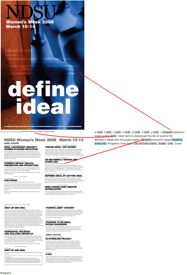
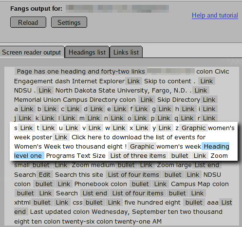
Here is a screen capture showing a site found recently at NDSU (dramatically reduced in size to be visible on your screen all at one time) next to a simulated screen reader output. Lines have been added to assist with connecting the screen reader version with the graphical browser version.

Understandably, the above text is not legible, but it should give you a general idea of how much TEXT information is visible in the images that a visitor may be interested in reading. Below, zooming in on the simulated output, the shear volume of information not available to visitors using assistive technology should become apparent.

Not only is the content inaccessible to unsighted visitors, but sighted visitors may struggle because the text suffers from image compression (meaning the letters aren't crisp and easy-to-read), and the text is not resizeable for visitors who are unable to read the tiny text.
Design of images
When using images on a web page, keep in mind that colorblind persons may visit the website and poorly designed images may become unusable.
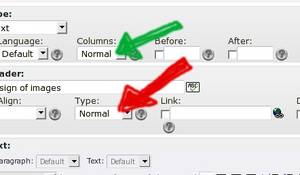
Consider the following example:
This is very important: Change the "Normal" to "Three" for the GREEN ARROW ONLY. This will delete your work if you change the RED arrow.

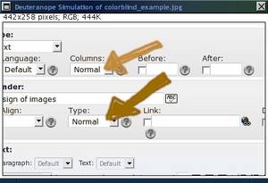
What a visitor with Deuteranope vision will see:
This is very important: Change the "Normal" to "Three" for the GREEN ARROW ONLY. This will delete your work if you change the RED arrow.

This is certainly bad. This poor visitor either has to find a friend to see the colors or hope they don't accidentally choose red and delete their work.
Keep this in mind when using images. Do not rely on color to be the only indicator of important information. Use shape/word references in conjunction with color indicators.
Use of other multimedia
Images are only one type of multimedia. The guidelines for other types, such as videos or podcasts, are similar to those for images discussed above. Whenever multimedia content is inserted, the information contained in the multimedia must be presented in additional way(s).
For example, a transcript is a functional alternative for a podcast. For videos, a transcript (synchronized, if appropriate) is a functional alternative.
These alternative formats may be of assistance to "normal ability" site visitors in addition to persons using assistive devices. For example, including a transcript before/after a video tutorial allows a visitor to print the page and follow the tutorial at her own pace later on, without an Internet connection to view the video.
Use of links
Dos and Don'ts for links
- Do NOT use common phrases such as "click here" or "here" for link text!!
- Link text should make sense *out of context*
- Do NOT use the same link text to point to two different pages
- Link text should be unique if the target page is unique
- DO separate links using something other than white space (white space includes carriage-returns and table cells). Examples of good separators are
- Text in a paragraph
- Explanatory text before/after each link
- Bullet/ordered lists
- DO use a link title that explains what purpose the link serves
| Bad | Good |
|---|---|
| Click here to download the latest version of anti-virus | Download the latest version of anti-virus |
Download anti-virus -or- Download anti-spyware | Download anti-virus -or- |
Use of tables
Generally, you should avoid using tables for layout. Though they can be made to be accessible, a fair amount of knowledge and planning is required to do so.
In the case of tabular data, CMS enables you to enhance accessibility by adding header cells and declaring their scope. Learn how to create header cells in CMS.
For more information on accessible tables, please reference WebAIM: Creating Accessible Tables.
Use of forms
As explained at www.access-board.gov, careful HTML coding must be in place in order to assure that people using assistive technology are able to access information. These special concerns center around associating a form label with the form input beyond visual cues.
For this reason, the CMS mail form content element has been carefully configured so the form displayed to Web visitors is as accessible as possible. This does come at a cost of flexibility for layout. In most cases, there will be work-arounds for this loss of flexibility. Please understand that this inflexibility is not necessarily desired and if a more flexible--but still accessible--option comes available, it will be considered for implementation of CMS at NDSU.
Work-around examples coming soon.
External content
Resources to author accessible documents, such as PDFs and DOCs.
- Consideration of alternative formats in general - http://www.webaim.org/articles/#richmedia
- North Dakota ITD resources
- Adobe booklet on PDF accessibility
- Consideration of PDF documents - http://www.usability.gov/pdfs/chapter3.pdf
Tools to evaluate accessibility
Evaluate adherence to Section 508 standards at www.section508.info .
Evaluate table accessibility by previewing how your table looks in a screen reader using the Tablin test or find out more about Tablin.
Evaluate adherence to Web Content Accessibility Guidelines (WCAG) using
- the TAW tool
- the WebAIM WAVE tool
- To evaluate any page on-the-fly, bookmark
javascript:void(window.open('https://wave.webaim.org/report?url='+escape(window.location)))
in your browser and select the bookmark when you are viewing the page you want to test.
Usually to bookmark, you can right-click your bookmarks toolbar and select "New bookmark" to get started. The exact steps you'll perform will vary depending on what browser you use.
- To evaluate any page on-the-fly, bookmark
- the Internet Explorer accessibility toolbar or the Mozilla/Firefox/Seamonkey/Netscape web developer extension
Evaluate usage of color on a page and how it may hinder people with colorblindness with the Vischeck test or use the Cambridge Vision and Hearing Impairment Simulator to understand the effects of other vision (and hearing) disabilities.
Use a screen reader emulator, like Fangs, available for Mozilla/Firefox/Seamonkey.
Discover more tools from the MIT checklist.
Note that these, and all, tools are not able to guarantee that your site is accessible even if they report no errors. Several "accessibility checks" cannot be computer automated, such as verifying that alt text include relevant information. However, several tools will list the "manual checks" that you should perform after automated checks are complete.
Other resources
- Research-based guidelines for accessibility
- About Section 508 - http://www.jimthatcher.com/webcourse1.htm
- Consideration of screen readers - http://www.webaim.org/techniques/screenreader/
- Note, the "HOW" section provides very good insight as to why web guidelines are important to screen readers!


