Template navigation
The department main page will appear in navigation as the "banner" text and link to the department's main page. There will also be a link to the department's page as a "home" icon in the navbar.
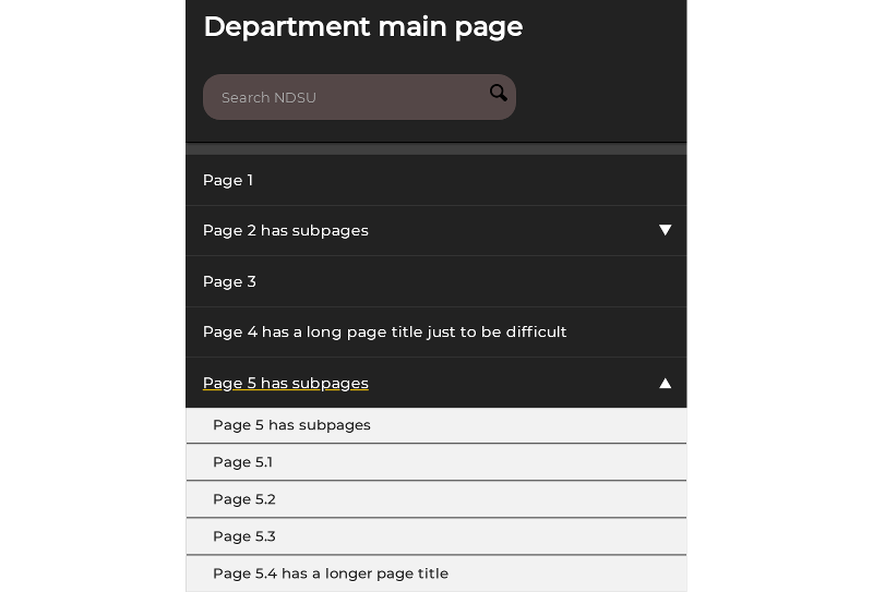
Pages directly under the main page (level 1) appear as a horizontal list on desktop-size screens and as a vertical list menu on small screens.
Child pages (level 2) appear as a drop-down menu when the level 1 page is hovered/focused on large-size screens. On small screens (such as mobile phones), the vertical list can be expanded by clicking the arrow.
Deeper pages (level 3 and beyond) may appear as a vertical menu in the body content area when viewing the level 2 page that has sub-pages and if a template that displays deeper pages is applied.


Icon buttons

You should use Icon Buttons sparingly, to bring extra attention to a call-to-action. Overuse muddies the page with too many "most important" next steps / actions.
- Create a new content element
- Select type Special elements > Icon Buttons
- Click the +button button
- Enter the Label text that will in the button
- Enter the Link address where the button links to (click the link button to browse the Page tree to select an internal page)
- Enter the Icon name class to be used for the button (browse icons at fontawesome.com-- it's a good idea to copy-paste the desired name)
- Note: If you don't want to use an Icon in the button, use the RTE to add a button link instead.
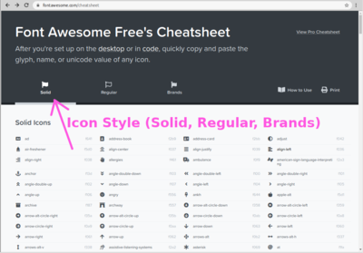
- Set the Icon Style to be used for the icon. Styles only available in PRO will not work. See which icons are available in each style using the Icon Style tabs at fontawesome.com/cheatsheet
- Select a Color for the button
- Select a Size for the button
- To create another button, repeat from Step 2
- Save, close, and publish as usual
An example of the buttons (two buttons in one content element) follows.
Buttons in RTE
You should use "button" links sparingly, to bring extra attention to a call-to-action. Overuse muddies the page with too many "most important" next steps / actions.
You can create a "button" link in the RTE by
- In the RTE, click within the link that should display as a "button"
- From the Text style menu, choose btn , then choose btn-primary or btn-secondary as appropriate.
btn + btn-primary or btn + btn-secondary
To remove the button style,
- In the RTE, click within the "button" link
- From the Text style menu, choose Remove text style until the link displays as a regular link (generally at least twice to remove each the btn-primary and btn text styles)
Social Media nav
A navigation list of social media platforms. Displays only the platforms you choose that apply for your department.
- Insert a new content type of type Social Media page links
- Select a Display as ("+ text" variants are suggested for best usability / accessibility). Available options are:
- Icon only
- Icon + text (horizontal)
- Icon + text (vertical)
- Set an Override "us". This is used in the text of the link, such as
Find Override "us" on Facebook
If you don't set this, there's an increased likelihood privacy blockers will hide the links from view in the visitor's browser. - For each profile link to add,
- Click +profile
- Select the Service, such as Facebook
- Paste the profile URL from the profile page into Profile URL or click the link button to browse to a page in your pagetree (useful if you already have an external page shortcut to the profile so you only have to maintain the address in one place)
- Save and close
- Publish as usual


