COMM 242, Advanced News Photography (Photojournalism)
COMM 362, Design for Print
Instructor: Ross Collins
A brief introduction to color theory
Modern color theory is based on three primary colors, projected colors red green and blue, or its printed complements, cyan, magenta, and yellow (that's yellow, hard to read on a white background, no?). A fourth "primary," black, is used for printed color.
Additive color
 The additive primaries red green and blue generate color by beginning with absence of color, black, to generate all colors. The three colors are projected onto a screen in various intensities to produce all colors. This principle generates color for televisions, computer monitors and movie screens, that is, all projected color.
Color on television and monitors is produced by three color "guns" corresponding to each additive primary. These produce color intensity based on a voltage level, from 0 to 255. Obviously, 0, 0, and 0 will produce black, or absence of color, and 255, 255 and 255 will produce white. Other colors correspond to a specific voltage combination. Multiple 255 times 255 times 255 and how many color combinations do you get? More than 16.7 million, presuming your monitor is capable of showing that many (most modern monitors are capable of this 24-bit, or "true color").
Note that if you project the additive primaries, say, from a spotlight onto a stage, a combination of two will produce a subtractive primary (illustration at right).
Red + green=magenta.
Green + blue=cyan.
Red + green=yellow.
Red + green + blue=white, the whole spectrum.
Subtractive color
 Printers and anyone working with color on paper or another reflective surface can't work with additive primaries. This is because color reflected from a surface begins with white, or a light color. Keep in mind white is all light together (think of your prism experiment from grade school), meaning that ink or paint subtracts from that white to produce the colors you see. In effect, pigment acts as a filter.
Picture a piece of white paper in sunlight. All sunlight is reflected from it, so the paper appears white. Draw a line in red magic marker. That area appears red because the marker is absorbing blue and green from the white reflection of the paper, but it can't absorb red, so it transmits that.
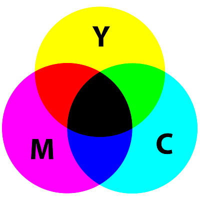
This is the principle of subtractive color, or CMYK color, the "process-color process" used by printers. Cyan (blue-green), magenta (red-blue) and yellow (red-green) inks are used along with black ("K," meaning Key color) to filter reflected white from the paper and produce all colors. Again, we can combine two of these subtractive colors to produce the additive. For example, cyan + magenta filters first the red, then the green, to produce blue (illustration at right).
Cyan + magenta=blue.
Magenta + yellow=red.
Yellow + cyan=green.
Cyan + magenta+yellow=muddy brown, hence the need for black ink.
Note that printers are constrained as web and television producers are not--printers cannot adjust ink levels to such an extent. In fact, most process color uses only four translucent inks. The ink is either on or off. To produce all colors then, color pictures have to be broken into tiny dots, called the halftone process. The closer these dots are to each other, and darker the color--also the principle of black-and-white reproduction, which uses only one ink, black. In color reproduction, the dots overlap to act as tiny filters on the white page to produce combinations of colors. Yes, it's a complicated process, and that's why good color printing demands skilled technicians in the back shop.
 Halftone quality corresponds to computer monitor quality based on the number of dots of ink per inch, or dpi. Sometimes this is called a screen. A 65-line screen, for example, is 65 dpi, quality good enough for newsprint reproduction, but not for high-quality magazine reproduction.
Techie Note: Low-quality screens are necessary for newspapers because the ink needs to blot into the paper to dry quickly, therefore producing the muddy look called dot gain. Magazine paper is high quality, so that the ink can dry by oxydation, which takes longer. Newspaper people are in a hurry to get their product out, and can't wait for ink to dry.
Many newspapers use 133-line screens, as do some magazines. Others use even finer screens, that is, more dots per inch, for a finer quality reproduction. Illustration at right shows a closeup of halftone dones, and how the eye sees it from farther away. You can examine the dots yourself in any printed publication using a magnifying glass or loupe.
Photographers working in Photoshop use the RGB system, logically, as they are working from a computer monitor. Photoshop can translate that into the CMYK system for printers, however, using a corresponding set of numbers for each RGB color. Photographers are sometimes asked to convert to that Mode before sending to a printer, or the printer will do it.
Color and emotions
Color alone can add powerful emotional impact to a photograph or design. The impact is based on the saturation of the color--muted colors are more calming, bright colors more exciting--but also on a complex symbolis system of color in culture. Colors take on symbolic cultural meanings. The complicating factor is that those meanings change depending on cultures. White may mean purity or new life in Western countries, but death or the end of life in other countries. Here is a detailed evaluation of color symbolism around the world.
How well do you know color theory for photographers and printers? Take this wee quiz.
Note: Illustrations are from Wikipedia.
 The additive primaries red green and blue generate color by beginning with absence of color, black, to generate all colors. The three colors are projected onto a screen in various intensities to produce all colors. This principle generates color for televisions, computer monitors and movie screens, that is, all projected color.
 Printers and anyone working with color on paper or another reflective surface can't work with additive primaries. This is because color reflected from a surface begins with white, or a light color. Keep in mind white is all light together (think of your prism experiment from grade school), meaning that ink or paint subtracts from that white to produce the colors you see. In effect, pigment acts as a filter.
 Halftone quality corresponds to computer monitor quality based on the number of dots of ink per inch, or dpi. Sometimes this is called a screen. A 65-line screen, for example, is 65 dpi, quality good enough for newsprint reproduction, but not for high-quality magazine reproduction.