Return to student work index.
Return to Department of Communication
COMM 421: History of the Mass Media
Instructor: Ross Collins, Department of Communication, North Dakota State University
Student work 2007: The best of student research in local and regional history.
Publication design reflects more than the tastes of a designer; it explains the history and culture of the publication as it fills the needs of the audience it wishes to address and reflect. In this research Danielle Troske considers early days of The Spectrum, North Dakota State University's student-produced newspaper, and how its design changed dramatically with the times.
Danielle Troske
Evolution of the Spectrum:
A Comprehensive Look at the Design and Layout
Joseph Pulitzer once said, "Put it before them briefly so they will read it, clearly so they will appreciate it, picturesquely so they will remember it and, above all, accurately so they will be guided by its light." These simple values still guide the newspaper industry today albeit ever changing and expanding. How these values are conveyed to the public is often demonstrated in its design and layout, the visual depiction of important news. As technology has become available, how that news is depicted in a newspaper has evolved as well.
North Dakota State University's student newspaper, The Spectrum, was first published more than 100 years ago as a monthly publication. The Spectrum has also progressed throughout its existence, changing from a book-sized publication to a full-page, broadsheet newspaper. This paper will serve as a channel through which the design changes of The Spectrum are presented. Only the design and layout of the newspaper will be examined, as analyzing every element of the newspaper would prove lengthy and ambitious.
This paper will provide a brief explanation about the newspaper's first 11 years of existence, a period of much change and expansion. To find out how the newspaper changed in the 100 years that followed, issues from the years 1907, 1927, 1947, 1967, and 1987 were examined for their layout and design.
To narrow my paper's focus, I opted to briefly detail the first 11 years of The Spectrum's existence before selecting five different issues, 20 years apart. As an editor in chief who changed the newspaper's design, I was extremely interested in finding out how much the newspaper changed leading up to this year's issue. I was uncomfortable with the idea of only analyzing a certain range of issues without knowing what had led up to the issues at which I was looking. I felt that providing a synopsis of the first 11 years and then analyzing an issue from years selected a specific range apart would provide a holistic view of The Spectrum's layout and design history.
When I began researching this paper, I was simply examining how The Spectrum looked and how other editors like myself left an indelible mark on a piece of NDSU's history. As I went through issue upon issue, I realized that how a paper looks conveys so much more than a different and individualized design. What a newspaper looks like demonstrates changing times and new technologies. For example, the first photograph appeared in The Spectrum in 1899, corroborating with the same time photojournalism had been introduced to newspapers.
Williams (1998) divided the history of American newspaper design into three categories: pre-industrial, traditional, and modern. The Spectrum emerged during the traditional time period when newspapers began increasing their use of visuals and multiple-column headlines were printed more frequently. Newspapers were also designed in narrow columns with many typographical variations, which resulted in a publication that "was at first visually proper and strict in its narrow columns but featured design flourishes to emphasize stories of importance" (Williams, 1998, p. 444). The first years of The Spectrum reflected these design principles, but began to change as time and technology advanced.
 History of The Spectrum
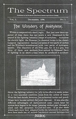
The first issue of The Spectrum appeared in December 1896, as a book-sized, 16 page paper. A simple masthead floated above the line "Published by the Students of the North Dakota Agricultural College," with the volume number, date, and issue number below that. The front page story, "The Wonders of Acetylene," was laid out in two columns, with a line dividing those columns. A border with small detailing outlines the entire front cover. A picture of Old Main that is perhaps a 2 X 3 inch is framed by a decorative border and divides the story into a top and bottom section. It was difficult to discern the font sizes used as the newspaper was book sized, but the headline size is not extremely large or overbearing. I would guess the size on an 8 1/2 by 11 sheet would be 18 points while the body text is perhaps 12 points. The inside pages followed a two-column design with the same border outlining all content. I was interested to find that advertisements were placed at the end of the paper, after all editorial content was presented. The ads usually appeared on half of page 12 and were fully present on subsequent pages.
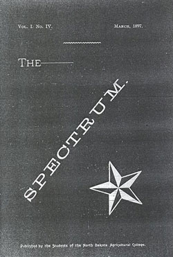
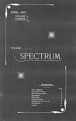
By the second issue, a minor design change had already occurred as the borders and lines outlining content and dividing headers were absent. The front page headline font size was exceptionally smaller than expected, in what looks like a decorative 12-point font with wide kerning. The next visual change occurred with the March 1897 issue when a new front page design debuted (see below). The new design featured the word "Spectrum." in all capital letters, approximately 36-point font size and printed diagonally across the page. In the bottom right corner shows a 2 X 4 inch, five-pointed, two-toned star. By the next month, the front page was different again and now featured a horizontal newspaper title in an approximately 36-point font size flanked by two small, multi-pointed star (see below). A new addition was a listing of the content of the paper and its included sections.
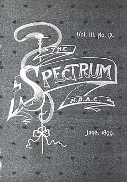
The Spectrum did not undergo another design change until June 1899 when the front page suddenly included a banner-like graphic with a detailed newspaper title (see below) in an approximately 72-point font. This issue was also the first to include photographs, a 5 X 7 inch picture of The Spectrum's editorial staff. The new design did not last long, as the following school year's first issue had returned to a simpler design resembling the earlier layout. Smaller, headline font sizes were used, which were usually bold and 14 points, only a few points larger than the body text. In the June 15, 1901, Spectrum three small graphics added a new dimension of design to the newspaper.
 By October 15, 1903, the fonts used in the newspaper changed from simple serif fonts to more decorative ones. For example, the newspaper title now appeared in approximately 40-points and the decorative font was also used for some sub-headings. The tagline also appeared in a new script font, and the headline was printed in a bold, decorative font. The fonts did not last long though, because by the December 15, 1903, issue The Spectrum had returned to simpler serif fonts. The May 15, 1906, issue included decorative drop cap designs within the content and was used for sub-sections. Smaller drop caps were also included with individual stories. All of the issues up to the end of the 1906-1907 academic year were two-column newspapers with only one story on the front page.
The Spectrum's Design Changes 1907-1987
1907
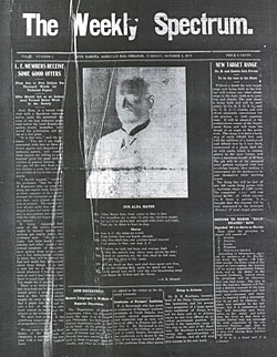
The most significant change The Spectrum underwent when transforming from a monthly to a weekly newspaper was that it actually began to look like a newspaper and looked like it increased to closer to a tabloid-sized publication. The paper was larger and now a five-column publication. The masthead, in a bold, approximately 64-point, sans serif font, read "The Weekly Spectrum." but instead of a tagline about being published by the students of NDAC it simply included the college, date, volume and issue number, and price, 5 cents. The body text was very small, possibly 8 points, and the columns were separated by lines (see below). Two headlines on the page were printed in approximately a 14-point font, while smaller headlines were about 10 points. A picture, presumably of A.E. Minard, and the lyrics to "Our Alma Mater" were the "center piece" and set off by an excess amount of white space. All headlines were written in all capital letters, and were a combination of serif and sans serif fonts.
 By March, the headlines were all serif and no longer in capital letters. The design of the issue also included a "center piece" about the Mammoth Parade complete with varying sizes of fonts and a small picture of an elephant. The largest headline was approximately 24 points, with others ranging from 20 to 14 points. The next design change in the year came in the May 19, 1908, issue where 1.5 X 2 inch mug shots of the yearbook editors were included on front page. The masthead also underwent a small design change when the "he" in "The Weekly Spectrum" was superscripted and underlined. There was also no period at the end of the newspaper's title. Another change included the addition of advertisements intermingled with editorial content.
1927
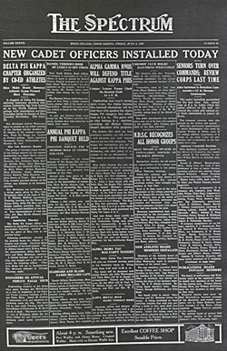
During the 1927-1928 academic year, The Spectrum continued to expand in its layout and design. The year saw a new masthead (see below) in an approximately 30-point decorative font and also included boxes to announce content and a bottom rail that featured ads. The five-column paper started printing shorter stories with many small, sub-headlines and included many small pictures and break-out boxes. The largest headline on the front page was actually larger than the masthead font, but many of the small headlines were only a couple of points larger than the body text. Top and bottom rails with font sizes ranging from 8 to 14 points were present in the rest of the paper, as well as the inclusion of many more advertisements. An interesting design development in the 1927 Spectrum appeared in the Oct. 14th issue, with photos of six football players that have no background but are positioned together (see below). The illustration is the first evidence of photographic experimentation in the newspaper, as most of the issues contained more text than pictures or illustrations.
1947
 Design change continued into the 1947 academic year, as the masthead was again changed, now using an approximately 36-point, typewriter-like font. The Spectrum remained a five-column newspaper, but the columns contained numerous shorter articles. Most fonts were sans serif and ranged from 20 to 14 points. Some headlines were italicized to set them apart from the rest of the headlines. The front page of the academic year's first issue featured an approximately 5 X 10 picture of "Paul Thonn and his campus Statesmen" and was the only illustration on the page. A bottom page rail contained an advertisement, a trend that continued throughout the year.
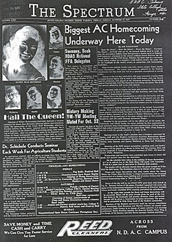
In the Oct. 17, 1947, issue, pictures of the reigning NDAC Homecoming Queen and the five candidates were featured on the front page. Several different fonts were used on the front page, varying is size and boldness. The front page was also only three columns, with the two larger flanking a small middle column. The largest headline on the page--a 26-point sans serif--also overlapped the small middle column, the stories of which were unrelated to the larger headline's story. The front page also included a 3 X 2 column break-out box of the homecoming events, although it was placed to the left-hand side of the homecoming article, and it seemed to be part of an agricultural article (see below).
By the November 14, 1947, issue, The Spectrum had returned to using five-columns but was still using a variety of fonts for its content. The main headline was a sans serif font, but varying sizes of serif fonts were also present on the page. Only one photograph, a 5 inch by 2 column picture, was included on the front page, and the picture of an upcoming performer took up nearly a quarter of the newspaper's front page.
1967
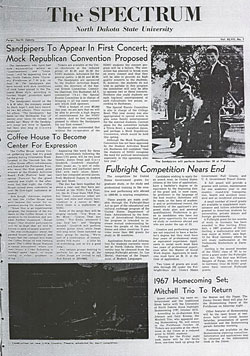
 During the 1967-1968 academic year, The Spectrum design was cleaner and less cluttered. A new masthead was again employed, and it again had five columns. However, no lines separated the columns, which contributed to the newspaper's cleaner design. The headlines were also all in a sans serif font, and the body text was a serif font. Headlines were written in a conservation and simple 24-point font, while the body text remained approximately 8 points. Two pictures were included on the Sept. 21, 1967, issue, including a 5 inch X 2 column photo of an upcoming performer and a 3 inch X 3 column picture of the construction underway on the Little Country Theatre (see below). The October 5, 1967, issue was the first issue to include a cartoon in the opinion section and several letters to the editor.
The Spectrum's clean and uncluttered design seemed to work against it on the front page of the Nov. 2, 1967, issue with the placement of pictures and related articles. For example, controversial poet Ed Sanders was scheduled to speak on campus, but the article was placed under the three-column picture in columns two and three, next a "Milk and cookies fail to arouse Senate support." This seems odd and misplaced because not only are the articles completely unrelated, but the placement seems to convey that the "Milk and cookies" article is more important than the poet's appearance on campus. The sans serif fonts for headlines were replaced by serif fonts in this issue.
In the Nov. 9, 1967, issue of The Spectrum a decked headline was used, but the smaller line floated above the larger headline, which is contrary to normal design style that dictates headline hierarchy with the larger above the smaller. The misplacement of articles continued in this issue as well, as on the opinion page a letter to the editor was split between three columns with a second letter to the end nestled in the first two columns of the aforementioned letter with its own headline. This was awkward to read because a person's eye naturally travels to the next column but in this case, the third column doesn't relate to the first and second. This awkward article placement continued on the front page of the Dec. 14, 1967, issue as well, which makes navigating the paper naturally very difficult. A positive aspect of this issue was the inclusion of a mug shot with an article, as well as two photographs placed in opposite corners.
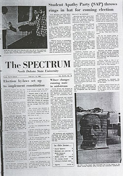
 A major layout change occurred with the Feb. 15, 1967, issue of The Spectrum. Up to this issue, the front page included a masthead at the very top of the page with the date, volume, and issue number underneath followed by all the content of the front page. With this issue, however, it seemed that the front page had been shrunk and two pictures and an article placed above and down the right side of the paper (see below). The newspaper was still five columns, and now included an "In this issue" break-out box. The headline fonts also decreased to approximately 18 points, while smaller ones were possible 14 points. In the Feb. 29, 1967, issue the first, hand-drawn cartoon of a local subject was included in the opinion section. The cartoon related to a letter written by the Spectrum advisor, Ray Burington, defending the salary Spectrum and yearbook editors receive for their work.
1987
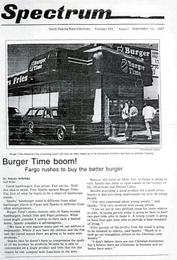
The design of The Spectrum transformed again for the 1987-1988 academic year. The front page masthead no longer included the word "the" before Spectrum, and there was a single story with a lone picture (see Appendix K). The front page was only two columns, and the body text had increased to about 10 points. The headlines were written in a sans serif font and approximately 20 points, while the body text was serif. This year's paper also included section mastheads for the individual newspaper sections, which were about half the size of the masthead font size. It was interesting to look at this paper, because it was the first year that The Spectrum began to resemble its modern successor. I saw many of the same elements that still exist in the 2007 edition of The Spectrum, including "Classifieds," and "Campus Clips."
The 1987 newspaper also included crossword puzzles and comic strips, and in one issue contained more than 10 pages of the cartoons.The advertisements were also much larger than in past years, often taking up more than ¾ of several pages and leaving very little room for editorial content. By the Jan. 9, 1988, issue, The Spectrum design resembled the 1967 design where the masthead was no longer at the top of the page but in the middle. Now a four-column newspaper, the front page included one story with a 3 inch X 1 column photo above the masthead and two stories and a 4 inch X 3 column photo below it. The headline hierarchy was also disrupted on this front page, as the largest headline was in the middle with the second largest at the top and the smaller ones on the bottom and side. A new feature for the newspaper included four break-out boxes at the bottom of the page with previews of stories inside.
 A Notation about The Spectrum's Content
I wanted to include a quick notation about the content of The Spectrum in the issues that I examined. I was quite surprised to find that in the first 11 years of issue hard news was not included on the front page but rather many of the stories were about national or abstract topics. To me, it didn't really look like a newspaper because of the topics presented. A few pages in, readers could begin getting some information that pertained directly to the North Dakota Agricultural College, such as the comings and goings of faculty, staff, and students. An especially intriguing section was the "Exchanges," which often included editorial comments, jokes, and encouragement. Another interesting section was The Spectrum's editorial section, and it was this section that became the newspaper's sounding board. As I was looking through all of the issues from 1896-1907, I found myself always stopping at these two sections to learn what issues the newspaper was facing at the time of publication.
The editorial section also discussed any changes the newspaper had made or would be experiencing, such as using "smaller type" (The Spectrum, 1898, p. 6) and moving from a monthly to weekly publication. In the commencement issue's editorial explained that the "rapid growth of the Agricultural College, the varied courses, and diversified phases of experimental work, together, have necessitated the changing of our policy and at the recent staff election it was unanimously voted to supersede the monthly Spectrum by an eight-page newspaper" (The Spectrum, 1907, p.139-140). With this major change came a future of design and layout changes for The Spectrum, which will be discussed in the rest of this research paper.
 As the paper resembled more a modern publication, I realized that one could discern a lot about the current time period by looking at what was printed in the newspaper. Williams (1998) discussed how the design of newspapers in the early 20th century was supposed to garner readership and bold headlines would grab attention quicker. While many of the stories in the 1927 and 1947 issues were not examples of hard-hitting journalism, it was evident that The Spectrum editors wanted people to read the newspaper. The 1967-1968 issues were the most interesting to look at in regards to headlines, because these newspapers were printed in a time of social change and the headlines reflected that. Many of the stories included in the newspaper explained controversial issues on campus, such as alcohol, and student rights, and the opinion section became a marketplace through which students and faculty could question and rail against current topics, such as the Vietnam War. One letter to the editor about the war was titled "I am only one student," while an editorial headline regarding the conflict flashed "For God's sake, why?" I believe these articles reflect the attitude people had adopted that they were supposed to question every authority figure that set out rules or guidelines for them with which they didn't agree. For example, one editorial headline screamed "Abolish exams--a timely cry," while a letter to the editor headline read "student objects to alleged misuse of letter to editor." After reading through the interesting articles in the 1967-1968 issues, I was surprised to find that all the 80s issues were very boring and mundane. The most surprising--and somewhat disarming--discovery I made in these issues was the extensive section of comics included in one issue. I felt this was an inappropriate use of The Spectrum as a powerful tool and communicated to the readers of the newspaper that reading comics was more important than reading the news.
 Conclusion
When I began this project, I was excited to see how the newspaper that I'd dedicated a year of my life to had looked when it was only beginning, as well as its progression to the publication it is today. The design of The Spectrum changed many times, but each change added character and another piece of the newspaper's history. I provided a succinct explanation of the first 11 years of The Spectrum's existence because I felt these years were the most experimental and showed the progression into a newspaper similar to what exists today. By looking at the issues of five different years, each 20 years apart would provide a comprehensive and interesting chronicle of The Spectrum's design and layout changes. Newspapers are a stamp of the issues of the day, and looking at past issues only makes me more excited to see where The Spectrum will go in the future.

 History of The Spectrum
 By October 15, 1903, the fonts used in the newspaper changed from simple serif fonts to more decorative ones. For example, the newspaper title now appeared in approximately 40-points and the decorative font was also used for some sub-headings. The tagline also appeared in a new script font, and the headline was printed in a bold, decorative font. The fonts did not last long though, because by the December 15, 1903, issue The Spectrum had returned to simpler serif fonts. The May 15, 1906, issue included decorative drop cap designs within the content and was used for sub-sections. Smaller drop caps were also included with individual stories. All of the issues up to the end of the 1906-1907 academic year were two-column newspapers with only one story on the front page.
 By March, the headlines were all serif and no longer in capital letters. The design of the issue also included a "center piece" about the Mammoth Parade complete with varying sizes of fonts and a small picture of an elephant. The largest headline was approximately 24 points, with others ranging from 20 to 14 points. The next design change in the year came in the May 19, 1908, issue where 1.5 X 2 inch mug shots of the yearbook editors were included on front page. The masthead also underwent a small design change when the "he" in "The Weekly Spectrum" was superscripted and underlined. There was also no period at the end of the newspaper's title. Another change included the addition of advertisements intermingled with editorial content.
  Design change continued into the 1947 academic year, as the masthead was again changed, now using an approximately 36-point, typewriter-like font. The Spectrum remained a five-column newspaper, but the columns contained numerous shorter articles. Most fonts were sans serif and ranged from 20 to 14 points. Some headlines were italicized to set them apart from the rest of the headlines. The front page of the academic year's first issue featured an approximately 5 X 10 picture of "Paul Thonn and his campus Statesmen" and was the only illustration on the page. A bottom page rail contained an advertisement, a trend that continued throughout the year.
  During the 1967-1968 academic year, The Spectrum design was cleaner and less cluttered. A new masthead was again employed, and it again had five columns. However, no lines separated the columns, which contributed to the newspaper's cleaner design. The headlines were also all in a sans serif font, and the body text was a serif font. Headlines were written in a conservation and simple 24-point font, while the body text remained approximately 8 points. Two pictures were included on the Sept. 21, 1967, issue, including a 5 inch X 2 column photo of an upcoming performer and a 3 inch X 3 column picture of the construction underway on the Little Country Theatre (see below). The October 5, 1967, issue was the first issue to include a cartoon in the opinion section and several letters to the editor.
  A major layout change occurred with the Feb. 15, 1967, issue of The Spectrum. Up to this issue, the front page included a masthead at the very top of the page with the date, volume, and issue number underneath followed by all the content of the front page. With this issue, however, it seemed that the front page had been shrunk and two pictures and an article placed above and down the right side of the paper (see below). The newspaper was still five columns, and now included an "In this issue" break-out box. The headline fonts also decreased to approximately 18 points, while smaller ones were possible 14 points. In the Feb. 29, 1967, issue the first, hand-drawn cartoon of a local subject was included in the opinion section. The cartoon related to a letter written by the Spectrum advisor, Ray Burington, defending the salary Spectrum and yearbook editors receive for their work.
 A Notation about The Spectrum's Content
 As the paper resembled more a modern publication, I realized that one could discern a lot about the current time period by looking at what was printed in the newspaper. Williams (1998) discussed how the design of newspapers in the early 20th century was supposed to garner readership and bold headlines would grab attention quicker. While many of the stories in the 1927 and 1947 issues were not examples of hard-hitting journalism, it was evident that The Spectrum editors wanted people to read the newspaper. The 1967-1968 issues were the most interesting to look at in regards to headlines, because these newspapers were printed in a time of social change and the headlines reflected that. Many of the stories included in the newspaper explained controversial issues on campus, such as alcohol, and student rights, and the opinion section became a marketplace through which students and faculty could question and rail against current topics, such as the Vietnam War. One letter to the editor about the war was titled "I am only one student," while an editorial headline regarding the conflict flashed "For God's sake, why?" I believe these articles reflect the attitude people had adopted that they were supposed to question every authority figure that set out rules or guidelines for them with which they didn't agree. For example, one editorial headline screamed "Abolish exams--a timely cry," while a letter to the editor headline read "student objects to alleged misuse of letter to editor." After reading through the interesting articles in the 1967-1968 issues, I was surprised to find that all the 80s issues were very boring and mundane. The most surprising--and somewhat disarming--discovery I made in these issues was the extensive section of comics included in one issue. I felt this was an inappropriate use of The Spectrum as a powerful tool and communicated to the readers of the newspaper that reading comics was more important than reading the news.
 Conclusion